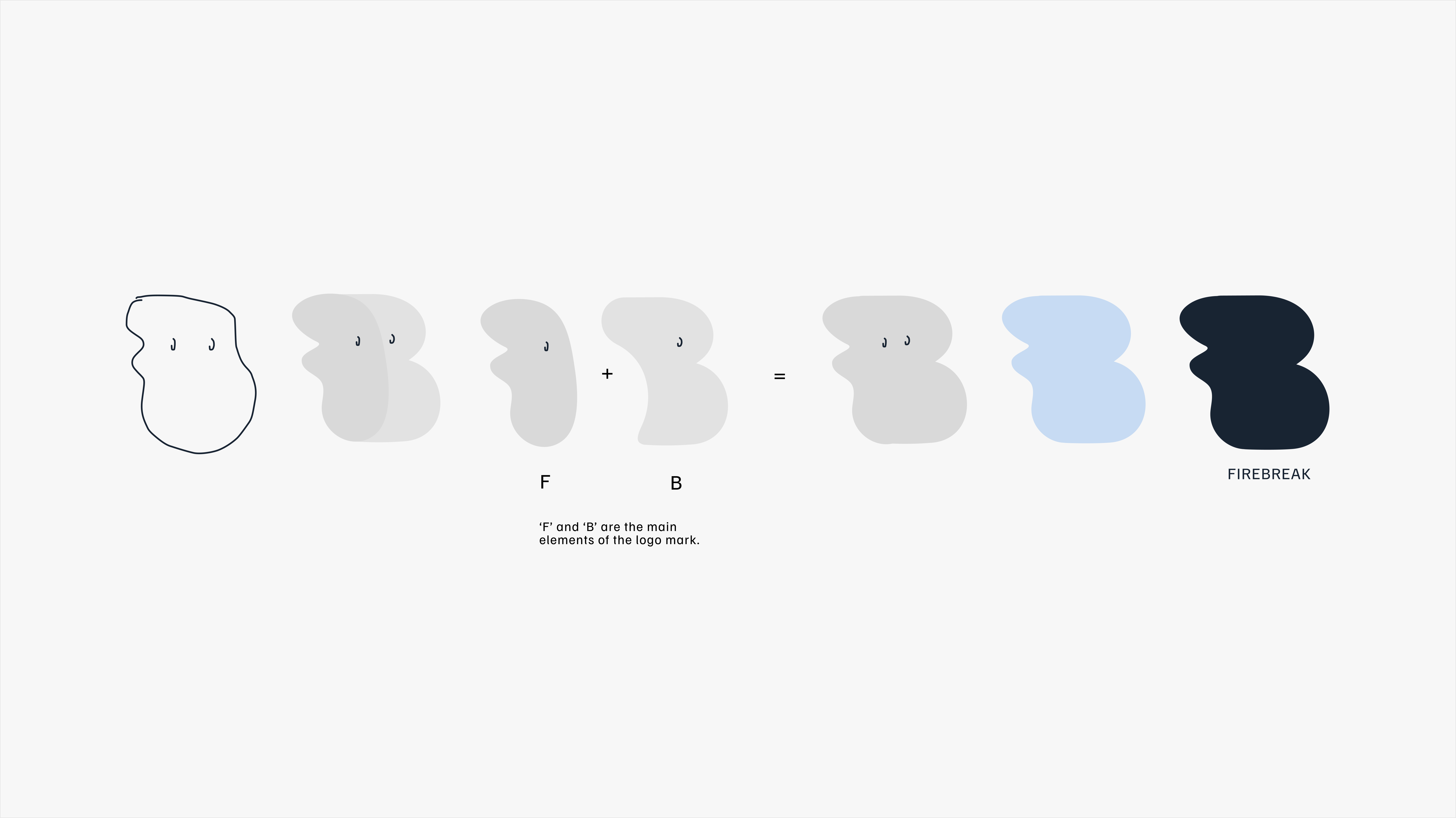
FIREBREAK
2026
Brand Identity
Creative Direction
Graphic Design
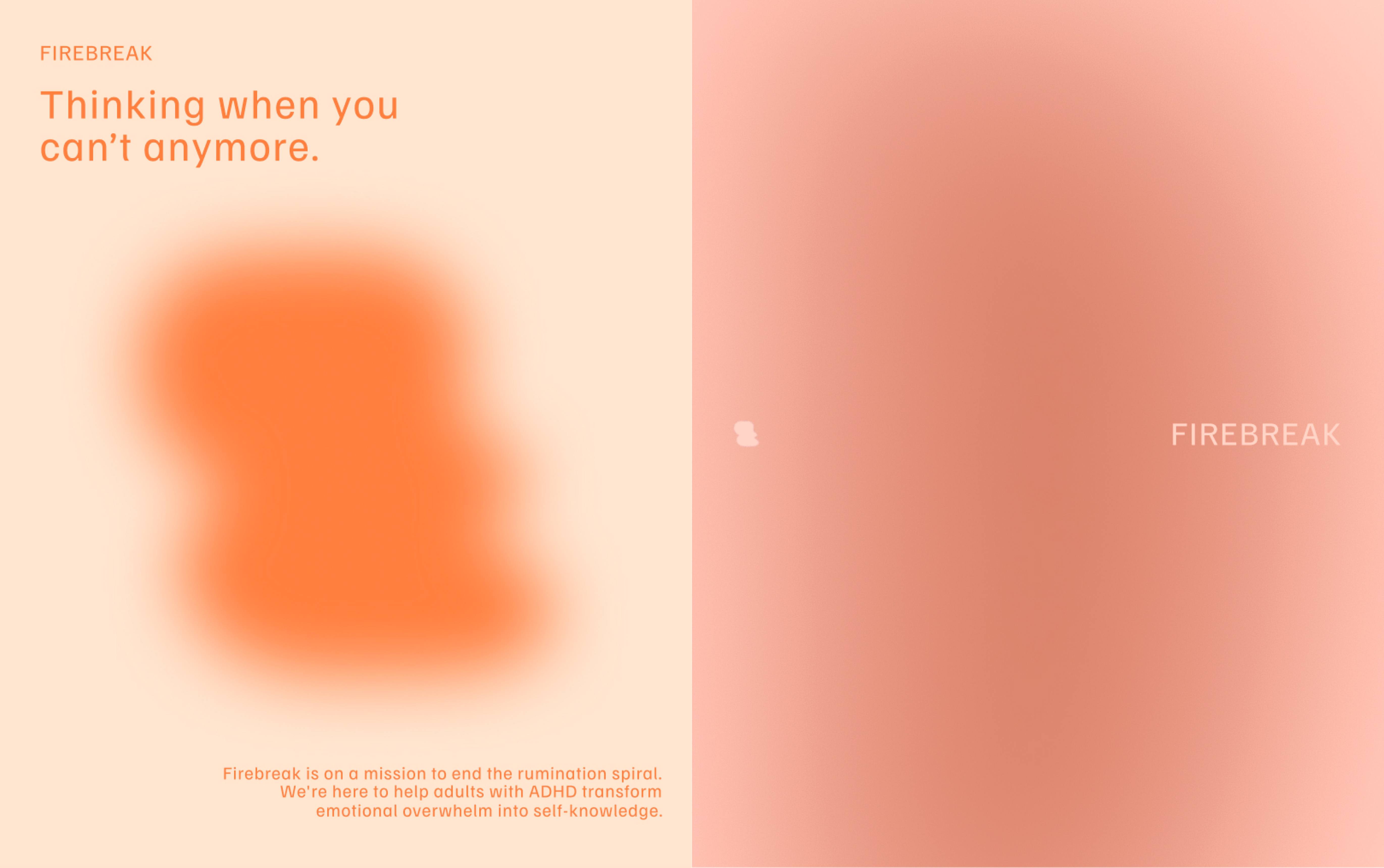
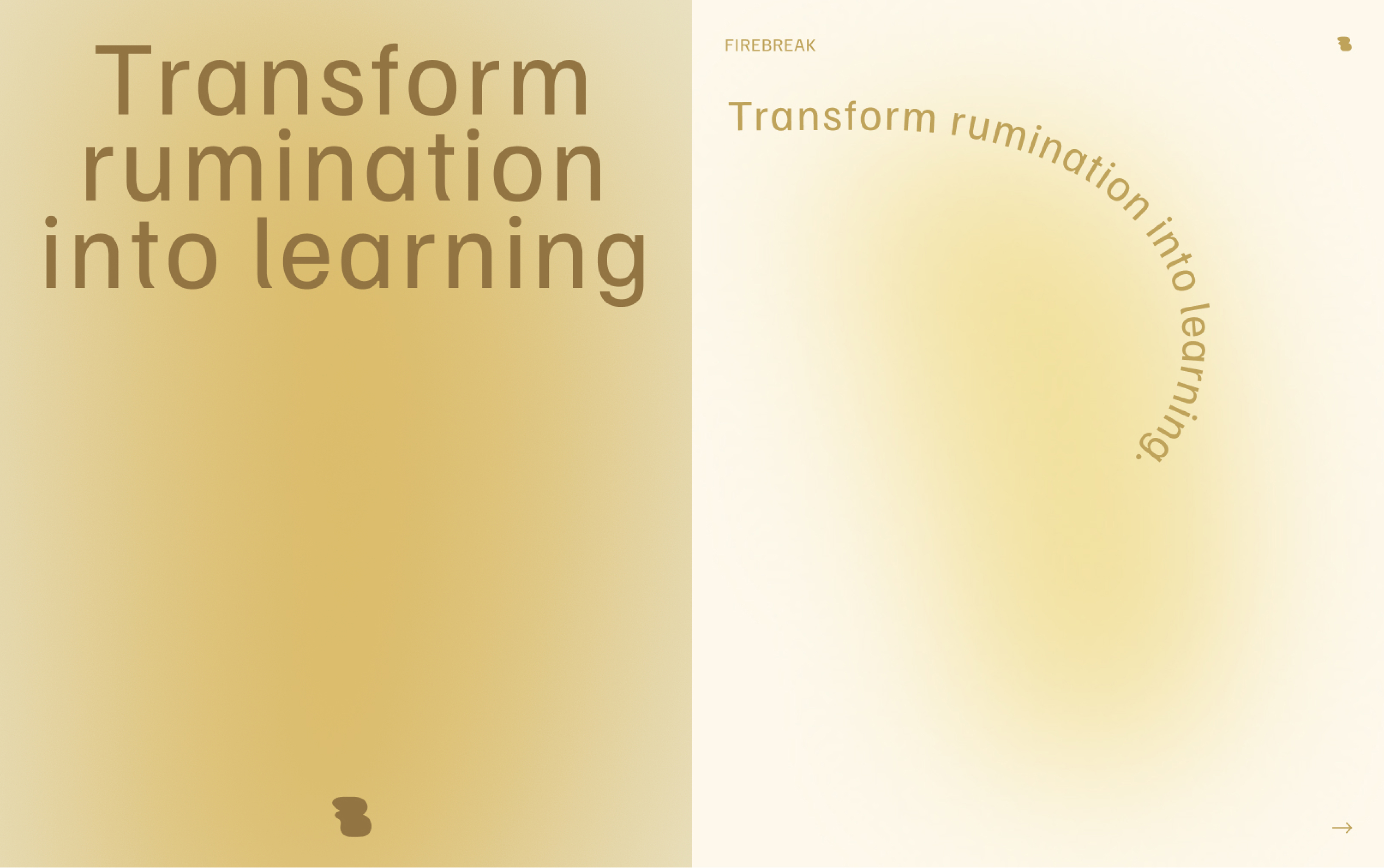
Firebreak turns emotional overwhelm into self-knowledge. We helped Firebreak transform into the companion as human as the experience itself, across Brand Identity & Creative Direction.
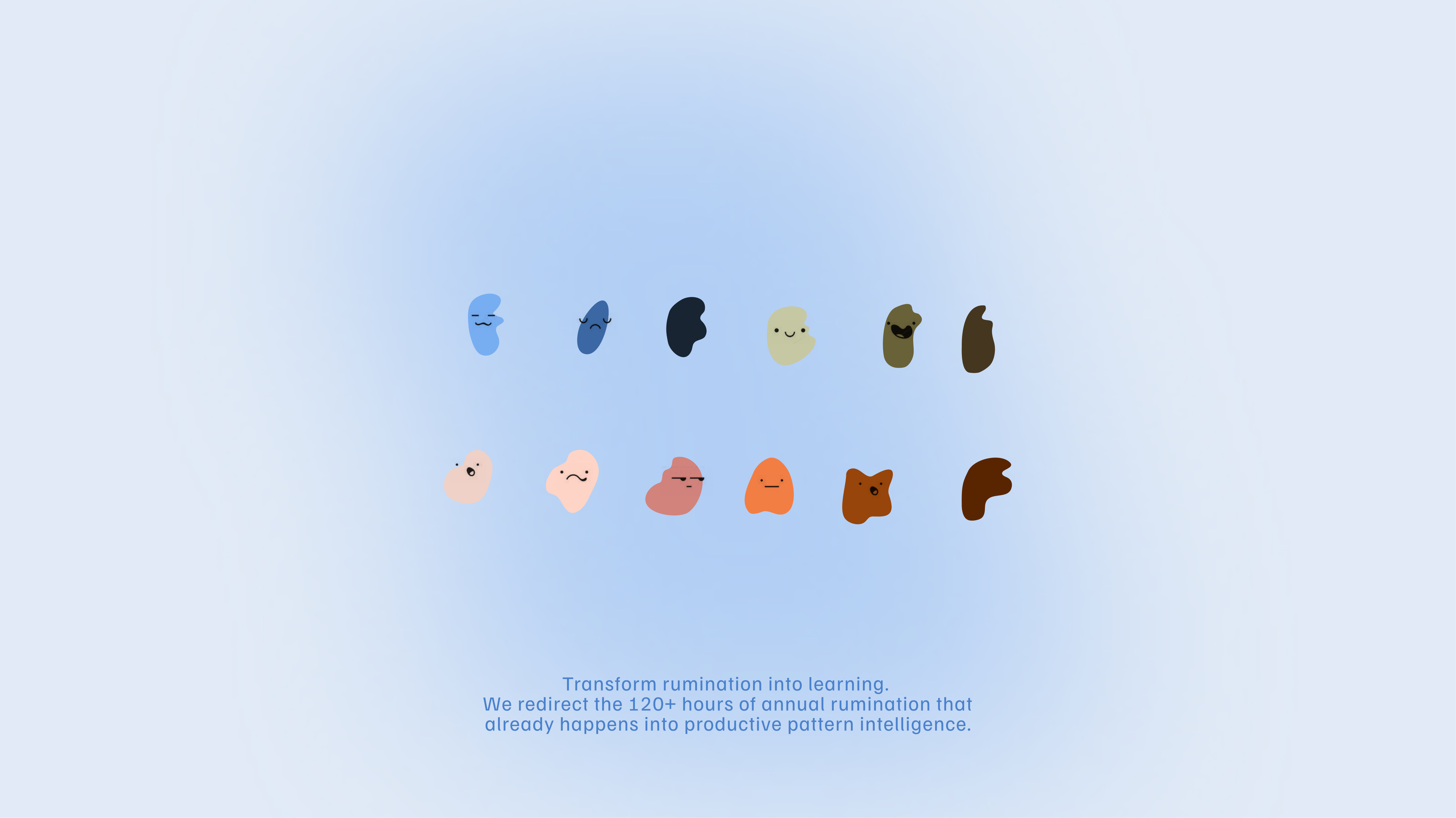
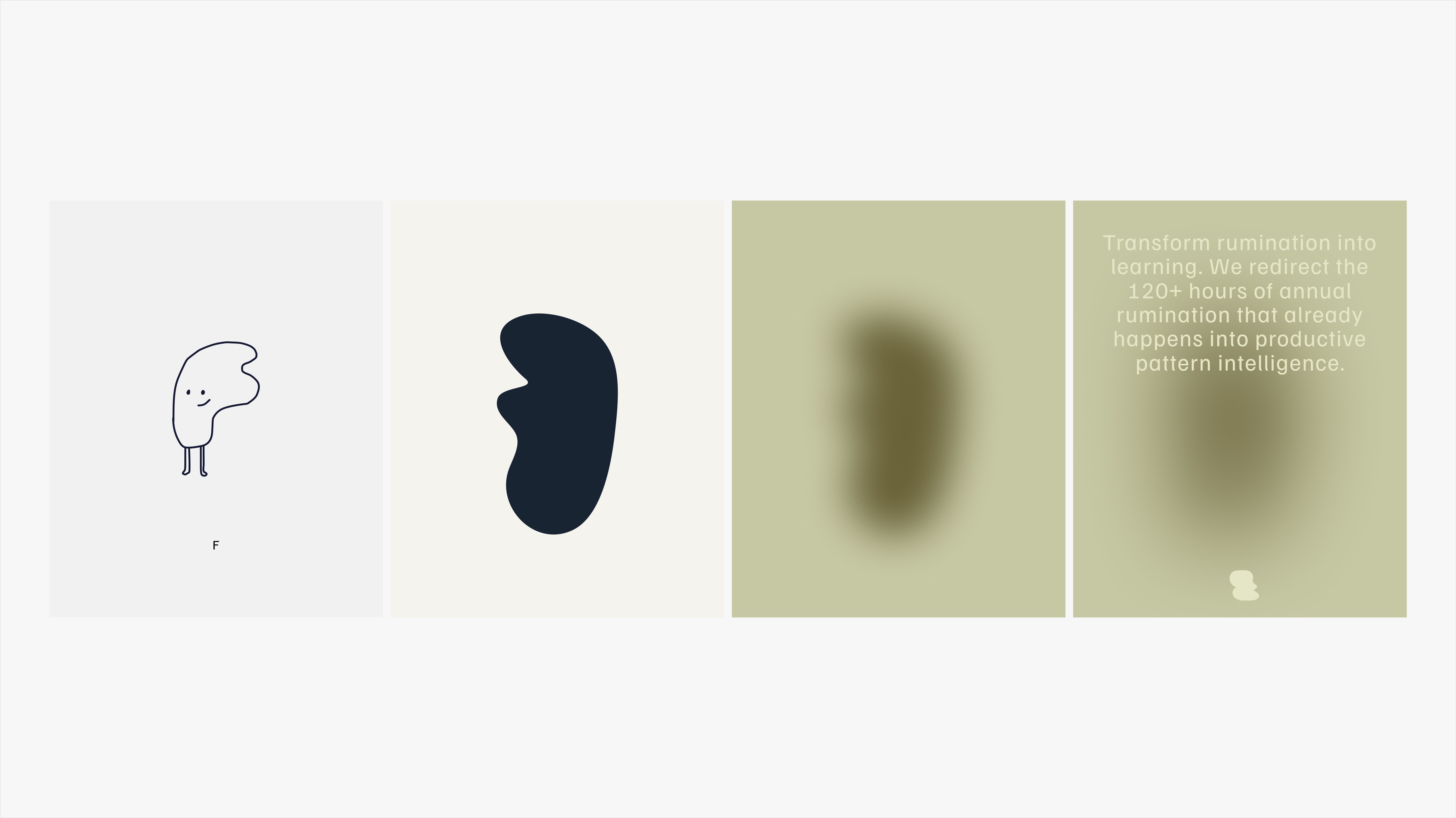
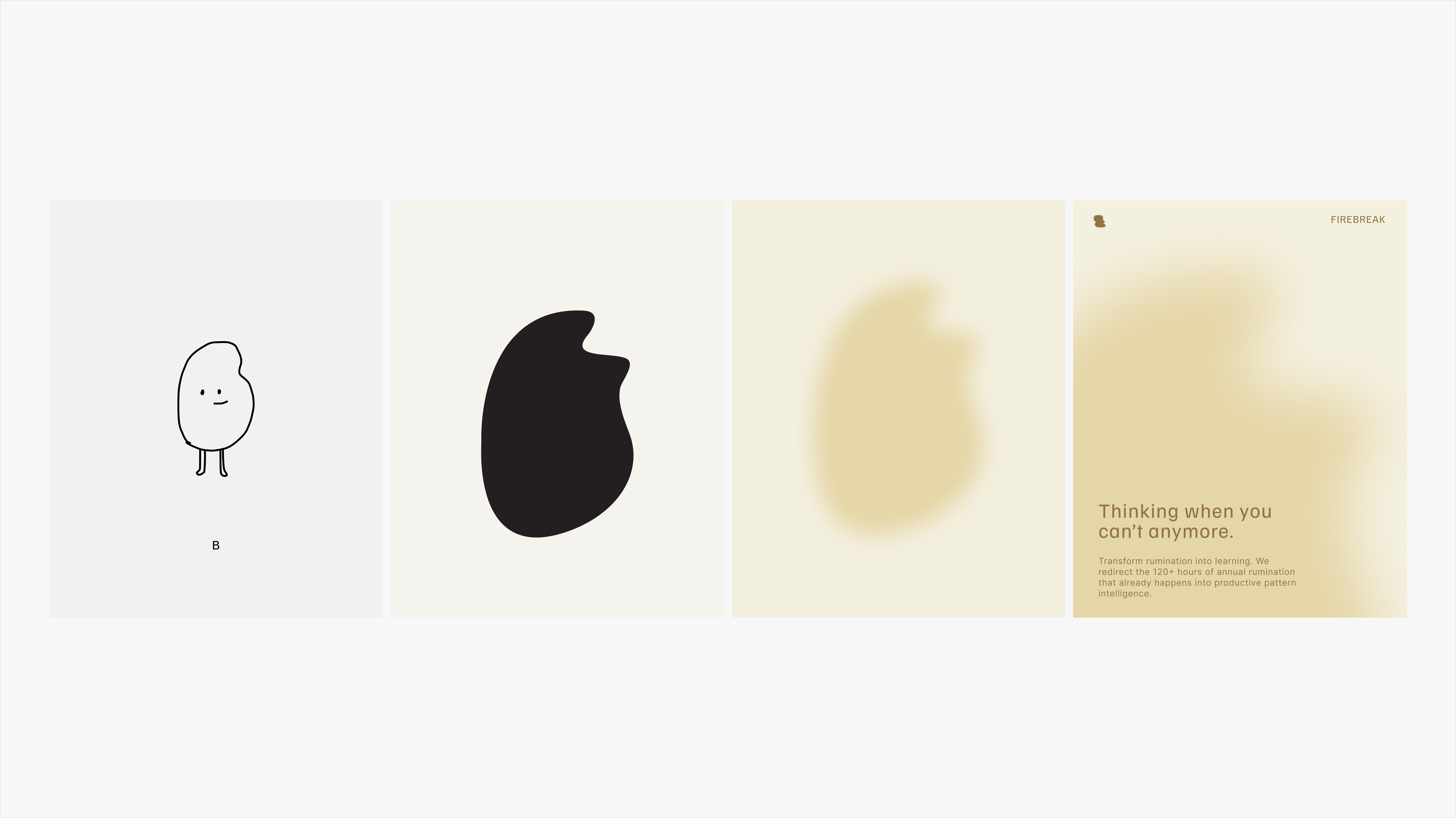
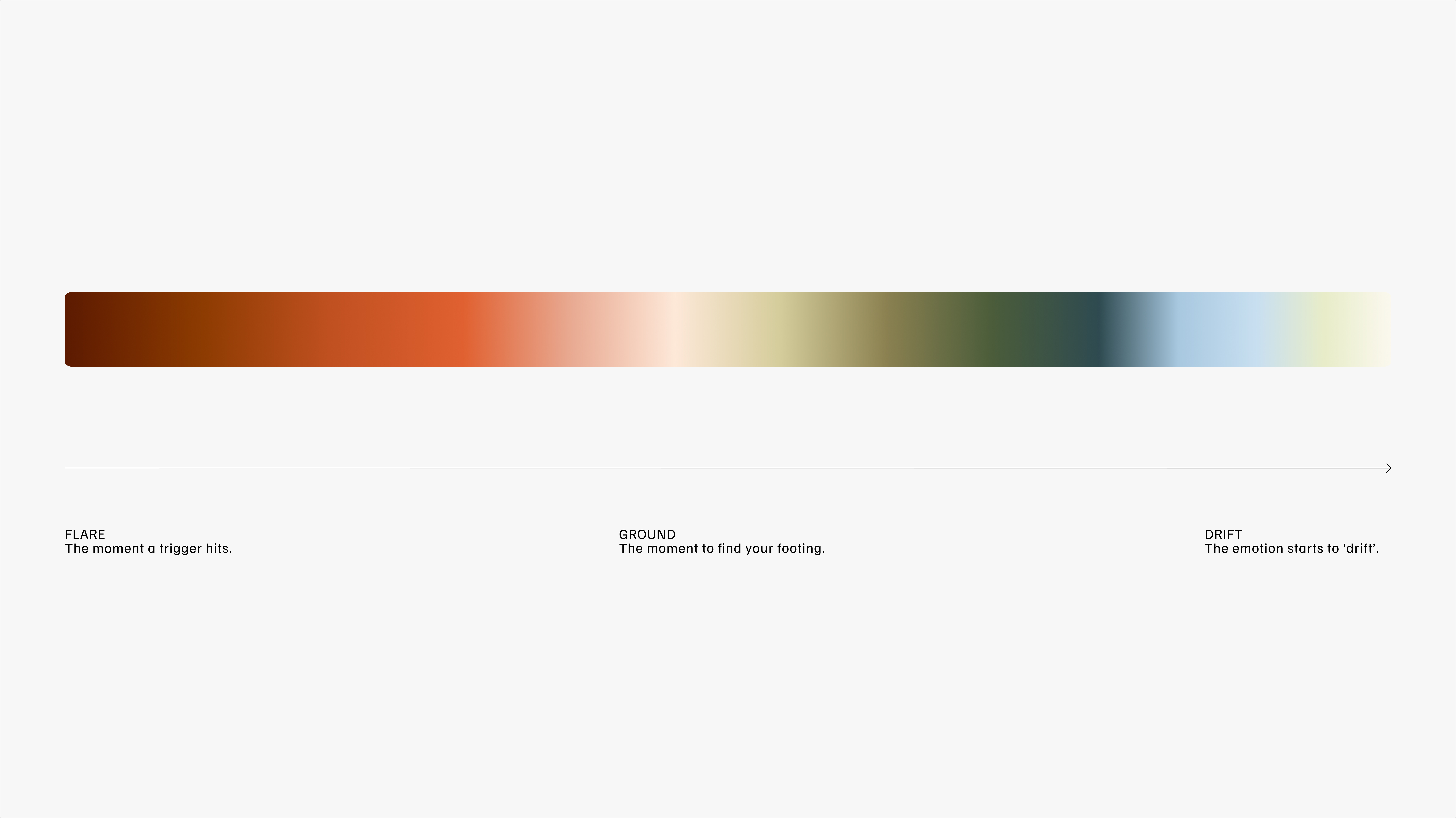
Firebreak colours function as an emotional expression. More than an aesthetic choice, the Firebreak colour palette is a visual tool for capturing the emotional timeline, from heated, to the in-between, to a more neutral state. Taken from the literal idea of breaking fire with water and earth elements, and expanded into a direct relation to emotional states. As those transitions happen, colour becomes a subtle visual language for marking where you are.